Custom CMS Grid Pattern
A comprehensive step-by-step guide on developing a custom CMS-based grid layout pattern in Webflow that repeats after a specified number of items.
Script
Documentation
If you are struggling to create a custom CMS based grid pattern the only way is to render the items with custom code in Webflow. This is a comprehensive guide where you will learn the technique to create any custom pattern.
Step 1: Identifying the rows
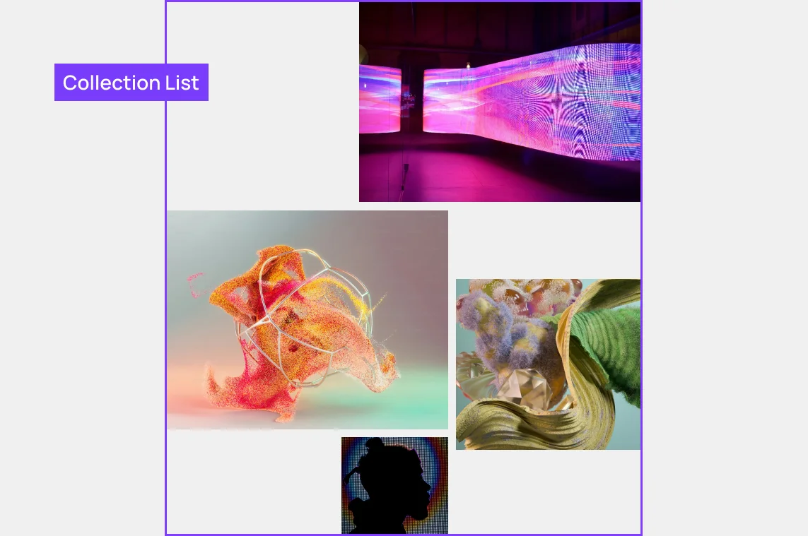
The first step involves understanding your design layout and identifying the number of rows necessary to construct the pattern.
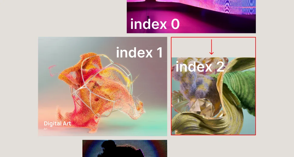
In our example, there are 7 items across 5 rows, forming a single pattern. Our goal is to develop a code that will repeat this pattern for every 7 items. If the collection list contains 14 items, we would observe the pattern being repeated twice.
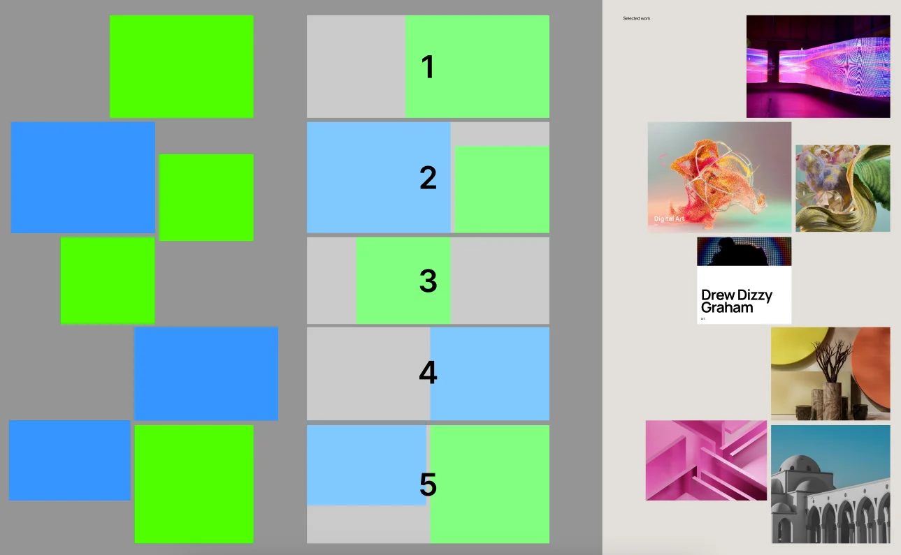
Step 2: Determining Columns
The next step involves figuring out how many columns each item covers and which ones it takes up.
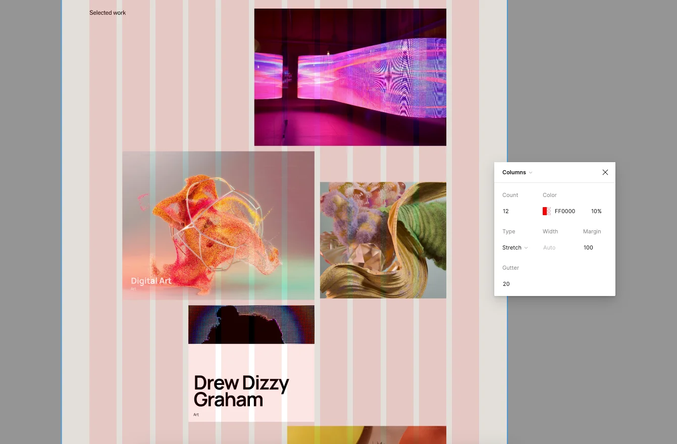
Step 3: Creating the HTML structure
This step is perhaps your favorite one. It's the moment to build the design in Webflow, shaping it to how the items ought to appear. You can also incorporate interactions within these items. These interactions might include hover, scroll, or mouse movement gestures.
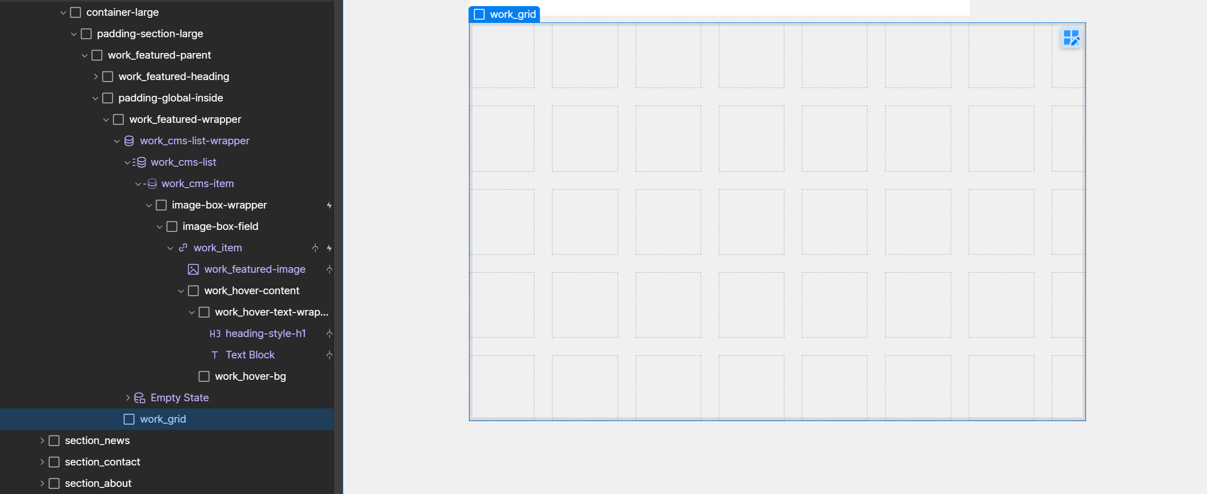
Remember the class names of collection-list and collection-item, as we will be using them in the code.
Since we're going to use a 10-column grid in this example, let's create a div block and set its display property to grid, and give it a class name.
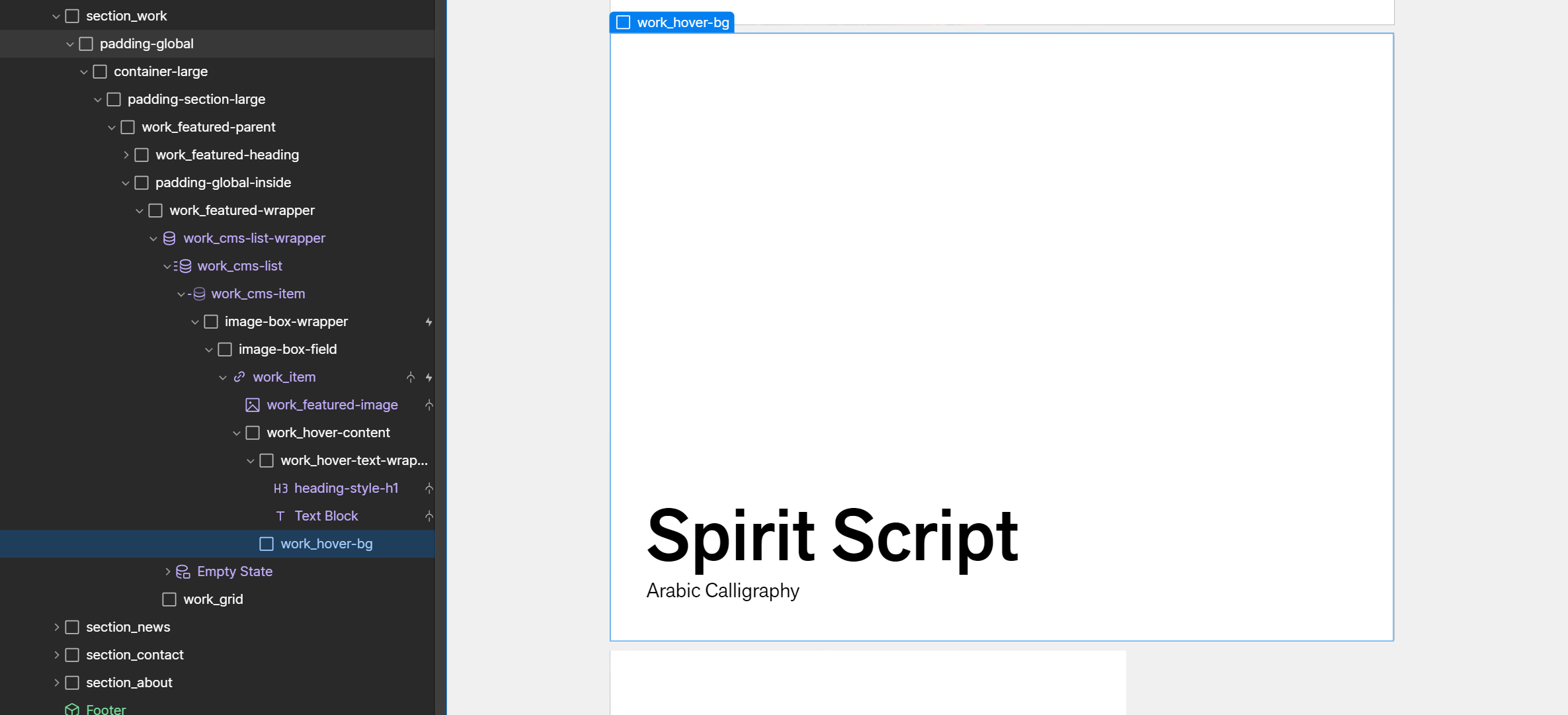
Step 4: Connect CMS Source
Connect your HTML structure with the CMS so that items will start appearing on the front end. You can also apply filters, conditions, and even limit the list using Webflow native options. Once we have the final list of items, it's time to add custom code to the page.
Step 5: Understanding code
The final step is to copy the code and paste it inside the before body closing tag in your page settings.
I'd also like to walk you through the key aspects of the code, and the necessary steps you should take to ensure it works seamlessly with your HTML structure.
> Update your collection-list and collection-item class names in the script.
> Update the number of rows and items per pattern.
const cmsItems = document.querySelectorAll('.work_cms-list .work_cms-item');
const grid = document.querySelector('.work_grid');

const numRowsPerPattern = 5; //Number of rows
const itemsPerPattern = 7; //Number of items in a single pattern
> To align an item at the bottom, simply keep the following code, then update the item index as necessary. If the item needs to be aligned at the top instead, replace 'end' with 'start'. Alternatively, you can remove these code lines if alignment is not required.
if (patternIndex === 2) {
	item.style.alignSelf = 'end'; // This aligns the item to the bottom
}
if (patternIndex === 3) {
	item.style.justifySelf = 'end'; // This aligns the item to the right
}
> If you wish to move a specific item with a negative margin, please keep the following code. Ensure to also update the item's index number. These code lines can be removed if a negative margin is not required.
if (window.innerWidth > 767) {
	if ((i + 1) % 7 === 3) {
		item.style.marginBottom = '-3rem';
	}

	if ((i + 1) % 7 === 6) {
		item.style.marginTop = '-3rem';
	}
}
> The following code assign columns to each item. Since I have 7 items in a single pattern, there are 7 lines of code that define the start and end columns for each item. Additionally, rows are also defined after the columns.
function getPlacementForIndex(index) {
  const placementPattern = [
    { colStart: 4, colEnd: 10, rowStart: 0, rowEnd: 1 },
    { colStart: 0, colEnd: 6, rowStart: 1, rowEnd: 2 },
    { colStart: 6, colEnd: 10, rowStart: 1, rowEnd: 2 },
    { colStart: 2, colEnd: 6, rowStart: 2, rowEnd: 3 },
    { colStart: 5, colEnd: 10, rowStart: 3, rowEnd: 4 },
    { colStart: 0, colEnd: 5, rowStart: 4, rowEnd: 5 },
    { colStart: 5, colEnd: 10, rowStart: 4, rowEnd: 5 }
  ];

  return placementPattern[index];
}
Conclusion
The goal was to demonstrate a technique that, when mastered, enables you to generate any type of CMS grid pattern.
By the way, the code will add one item per row in both landscape and portrait mode on mobile devices. If you wish to alter the pattern on mobile, feel free to ask ChatGPT for assistance in modifying the code.
If you're in search of a solution in Webflow, we're more than happy to offer our consultation services for free.